
Some design theory/rules (some creative artists purposely break the rules):
 |
| The flag dominance the picture |
. Emphasis - "Center of Interest". It is about dominance and influence. Most designers put it a bit off center and balance it with some minor themes to maintain our interest. Some others avoid emphasis on purpose. They want all parts of the work to be equally interesting.
 |
| Too big and too small |
. Harmony - When complementary layers and/or effects can be joined to produce a more attractive whole. The composition is complex, but everything appears to fit with everything else. The whole is better than the sum of its parts.
 |
| Very simple but attractive |
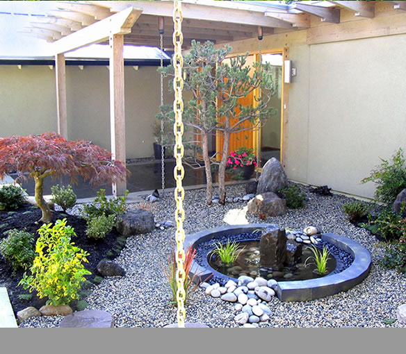
. Unity - When nothing distracts from the whole. But without variation, it can be uninteresting. Unity with diversity, generally has more to offer in both design and in life. Of course some very minimal design can be very calming and at times even very evocative, like a simple Japanese landscape that has a powerful effect.
 |
| Dramatic cloud effects |
. Opposition - Contrasting visual concepts. That same "clear and peaceful" Japanese landscape becomes very dramatic and expressive when the cloud comes a little dark.
 |
| Asymmetrical balance |
. Balance - The consideration of visual weight and importance to create stability. It is a way to compare the right and left side of a composition (symmetric, asymmetric, radial).
 |
| Variation and repetition |
. Rhytm - Can be used on all of the visual elements. If things are repeated without any changing, they can quickly get boring. However, repetition with variation can be both interesting and comfortably familiar. visual tempo creating movement.
. Proportion - Comparative relation of one part to another.
. Tension - Tenuous balance which capable of causing anxiety or exitement
sincerely, desperately fashioned
No comments:
Post a Comment