Composition and design is the topic which provides the baseline and infrastructure for all other areas of artistic development in design making. I'm not trying to provide a summary of composition and design here. I just want to tell that if you read through this article, you'll learn a huge amount about the different aspects of composition and how you can help yourself improve your designs.
First basic thing you have to know that the formal aspects of visual composition are like the grammar of a language. Like good literature and good poetry is more than words and subject matter, a fashion or an architecture design is more than what to presentate. The organization, the sentence structure, the style, and so on can make or break a good story. In design, the way the formal elements are arranged can make or break a good presentation idea.
The use of composition principles applied to the visual elements are like visual grammar. And looking for the visual elements of design principles does not have to limit the designer's options. They can focus the designer's experimentation and choice making:
1.Color
2.Line
3.Shape
4.Tone
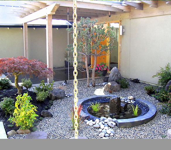
5.Texture
6.Form
Now think of the elements as the basic visual material with which to make a design. It's hard to imagine anything visual without the use of one or more of these elements.
Second rule have been explained in design principles as ways to work with and arrange the elements here.
Third rule is phi rule or some people say as golden ratio. Some believe that it is the most efficient outcome and the result of natural forces. Some other believe it is a universal constant of design and the signature of God. Whatever you believe, the pervasive appearance of phi in all we see and experience creates a sense of balance, harmony and beauty in the design of all we find in nature. It should be no surprise then that mankind would use this same proportion found in nature to achieve balance, harmony and beauty in its own creations of art, architecture, colors, design, composition, space and even music.
Compose your phi grid here.
And the fourth is rule of thirds which sometimes referred to the golden ratio and that’s not too correct. The golden ratio is a mathematic function usually used in architechture, describing the ideal relation of distance between objects to make it pleasing for the eye. The rule of thrids though is more valuable in design, thus a rule of composition.
It states that by dividing an artwork with evenly spaced horizontal and vertical lines creating 9 parts, the intersections of these lines are to be sought after as the most preferred focal points of a design. This is because at these points, the eye has the best perception of the main object in relation to the surrounding objects. By applying the rule of thirds to your design, you can stress the focal point and turn a rather dull image into something more interesting.
Let’s take a look at this example. This is an image of a kid at the beach. It’s shot without any rule or anything of that sort in mind:
Now, let’s see if we can make this image more interesting. What is the focal point of the photo? Where do we want the eye to jump to? I would say it’s the boy’s head. So scale the grid in order to put one of the four intersections right onto our intended focal point, like this:
 |
| cropping image |
Now, crop the image according to the new borders - and voilà, this is how our image looks now:
Finally, the fifth rule is about the eyepath. A designer shouldn't let the eyes of viewer unfocus. Stress the focal point(s) and devitalize the surrounding elements to produce an ideal “path” for the eyes. If you follow this rule and the eyes follow the path you create, leading to the effect, then you intend to communicate with your design.
To lead the eye, use the following elements:
1. sweetspot
2. block
3.exit
sincerely, desperately fashioned


